English
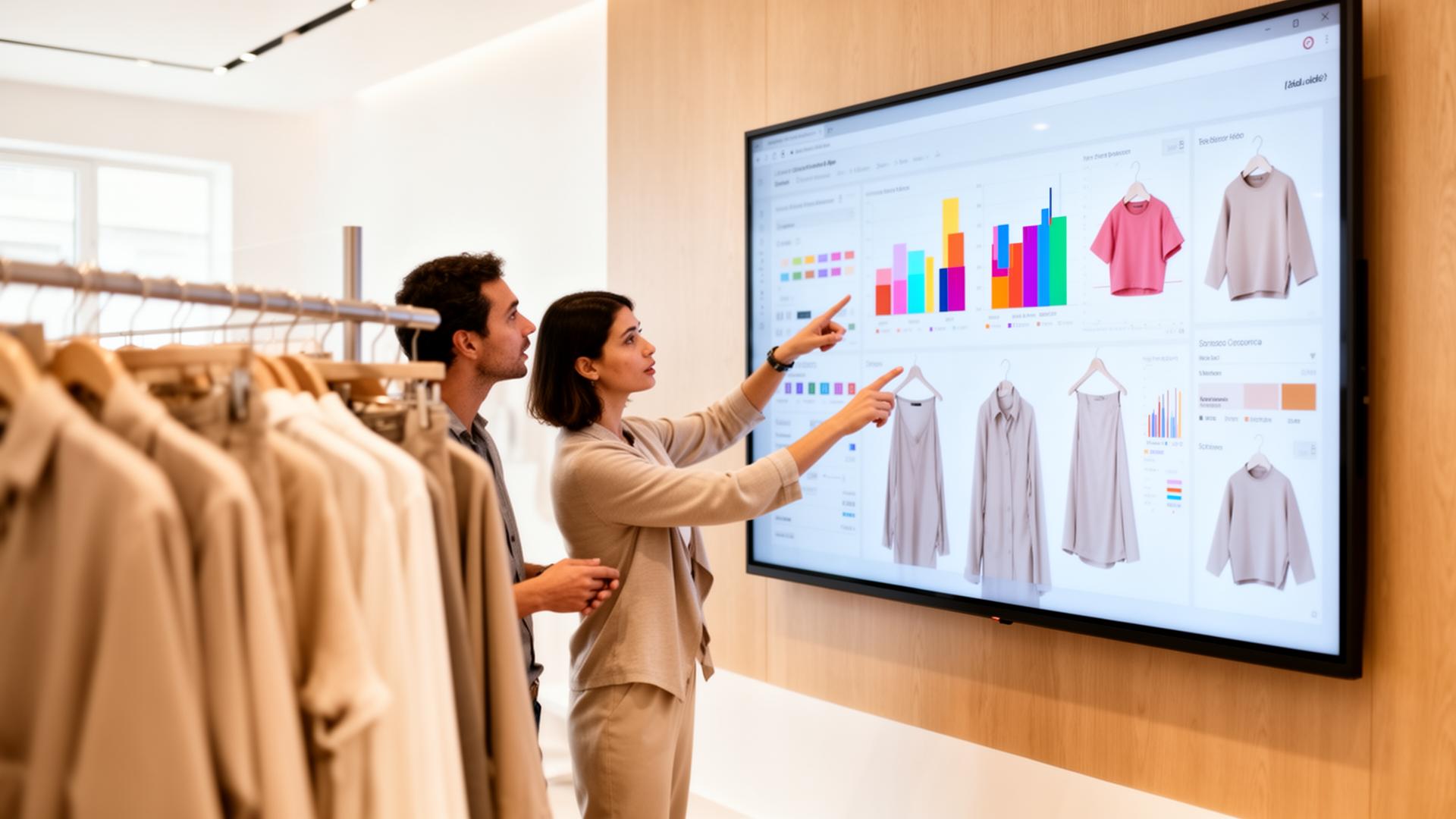
A useful fashion trend intelligence dashboard does not show you what is popular. It shows you what to do this week, who owns the call, and how much that call is worth if you are right or wrong. Twelve metrics get you there. The rest is decoration.
Most dashboards optimize for novelty. They surface viral imagery and rising hashtags, then leave the merchandiser to do the translation work in their head. That is the wrong unit of output. The unit a brand team needs is a decision: add a SKU, deepen a buy, hold price, pull forward a drop, or kill it. If a metric does not change one of those calls, it does not belong on the screen.
The second failure is freshness. Weekly trend reports are too slow for an 8-to-12 week production calendar. A dashboard that refreshes monthly is a report. A dashboard that refreshes daily, with thresholds wired into the line review agenda, is execution intelligence. See how we define the category in AI fashion trend intelligence.
Each metric below has one job: trigger a specific move. Read the table as the operating contract between trend, planning, and merchandising.
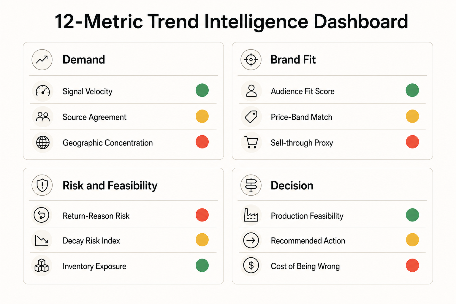

Twelve is the ceiling. Add more and the line review turns into discovery. Cut below ten and you lose the gates that protect AUR and inventory exposure. The discipline is to put every metric on the screen with a numeric threshold and a named owner, so silence in the room means approval and conversation only happens around exceptions.
Panel one is velocity and source agreement. This is the demand-side input: how fast is the signal moving and how confident are we that it is real. Panel two is audience and price fit. This is the brand filter: does this trend belong in our line, at our price, for our customer. Panel three is risk and feasibility: returns, inventory exposure, lead time, MOQ. This is the operating reality check that decides what is actually buildable in season. Panel four is the decision itself: the recommended action and the cost of being wrong, expressed as markdown exposure.
This layout keeps the buyer's eye moving in the right order. Demand first, fit second, feasibility third, action fourth. When a row of the table moves into the red, the dashboard auto-suggests the move and the line review only debates the override.
The cadence you choose is the cadence you operate at. A daily-refresh dashboard, paired with a weekly 30-minute line review, lets you act on early-rise signals before the saturation phase eats your margin. A monthly PDF locks you into the next quarter.
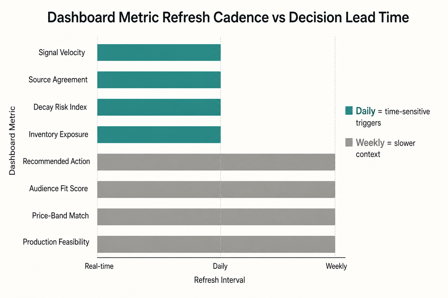
The mapping above keeps engineering costs honest. You do not need real-time on every metric. Velocity, source agreement, decay risk, and inventory exposure should refresh daily because they trigger time-sensitive calls. Audience fit, price-band match, and production feasibility can refresh weekly because the underlying signals move slower. Cost of being wrong recalculates on every depth change so the finance gate stays accurate.
A dashboard that ends at the recommendation is half a workflow. The other half is turning approved calls into briefs, moodboards, and tech packs without a week-long handoff. The F* Word is the validation and orchestration layer that closes that gap. Approved trend calls flow into auto-generated moodboards and briefs upstream. When design locks a garment, The F* Word generates a factory-ready tech pack in 8 to 10 minutes, including BOM and construction notes, for handoff to vendors. The dashboard recommends. The orchestration layer executes. See the full sequencing in the AI fashion merchandising launch workflow and the upstream view in creative direction workflow for fashion brands.
For the data plumbing behind the dashboard, including which sources to wire first and how to score source agreement, read how to build an AI fashion trend pipeline. For the buyer-side decision framework these metrics feed into, read AI trend intelligence for fashion merchandisers.
The first failure is metric inflation. A team starts at twelve, then adds three vanity charts a quarter later to keep stakeholders happy. Within two seasons the dashboard reads like a quarterly report and the line review drifts back to opinion. Guardrail: any new metric has to replace an existing one and arrive with a numeric threshold, a named owner, and a documented action. No threshold, no seat on the board.
The second failure is owner ambiguity. If both Trend and Merch own audience fit, neither will defend the gate when the signal looks exciting. Single-owner rows force accountability. Trend owns the demand inputs, Merch owns the brand fit filters, Planning owns the risk panel, Finance owns cost of being wrong, and the Merch lead owns the final action. Cross-functional debate happens at the line review, not on the metric definition.
The third failure is over-engineering the data layer. Teams spend a quarter wiring real-time pipelines for metrics that only need weekly refresh. Start with the three feeds in week one, prove the ritual, then invest in infrastructure where the cadence demands it. A spreadsheet board with the right twelve rows beats a real-time data warehouse with the wrong fifty.
Before the dashboard, line reviews run on slides. Each buyer presents their picks, the room debates aesthetics, and the highest-status voice usually wins. After the dashboard, the meeting opens with the board on the screen. Green rows are approved silently. Yellow rows trigger a 60-second discussion on the override. Red rows are killed unless someone produces evidence that changes a number on the screen. The meeting compresses from 90 minutes to 30, and the buys that ship are the buys the data supported.
How is this different from a trend forecasting report? A forecast tells you what will be popular. A trend intelligence dashboard tells you what to do about it this week, with thresholds and owners attached to every metric. The output is a decision, not a deck.
Do we need a data team to run it? No. The first version can run on three feeds: a social signal source, your sales and returns export, and a marketplace ranking tracker. Wire those into a single board with the 12 metrics, and a buyer can operate it. You scale infrastructure only after the line review ritual proves the value.
How does The F* Word fit in? The dashboard recommends. The F* Word executes. Approved calls become moodboards and briefs upstream, and a factory-ready tech pack in 8 to 10 minutes once design locks a garment. That closes the loop from signal to SKU to spec without a week of handoff meetings.
What is the minimum refresh cadence? Daily for velocity, source agreement, decay risk, and inventory exposure. Weekly for audience fit, price-band match, and feasibility. Real-time everywhere is over-engineering and adds cost without changing the decision.
How many metrics is too many? Past 12, the line review turns into discovery. Past 15, decisions stall. The discipline is to put a numeric threshold on every metric so silence is approval.
Ready to turn your trend dashboard into PO-ready decisions? See how The F* Word orchestrates approved trend calls into briefs, moodboards, and 8-to-10-minute tech packs. Explore the merchandising launch workflow.
Get The F* Word workflow insights in your inbox.